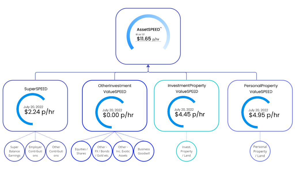
Is the sum of each of the four-investment asset sub-gauges, making up the total asset growth indicator.

The diagram above shows these asset values adding up to make the AssetSPEED™ indicator hourly rate value.
Before we move on to the relationship diagram for AssetSPEED™ it’s important to circle back to the compounding growth story and to highlight the distorted SPEED results one might get if they use unrealistic and potentially misleading Projected Capital Growth annual percentage values, or in the case of SuperSPEED™, the Projected Superannuation Earnings Rate (%). It’s prudent to be realistic about any compounding growth rate being forecast, so I hope you apply a cautious estimate when inputting these values to give you the most realistic picture of your current position.
The diagram below best illustrates how we summarise and bring all the gauges of the AssetSPEED™ side of the WealthSPEED® equation together, as it measures the projected total value movements of assets over an annual period.

Now let’s bring the full relationship picture together to display all the gauges and indicators that make up our WealthSPEED® result. (Click on the image below).
This should be your quick reference guide going forward, to help you gain greater understanding of all the gauges and indicators that make up WealthSPEED™. As you build up your understanding and confidence, you start to realise what impact and benefit this tool will have on helping you to take action.


