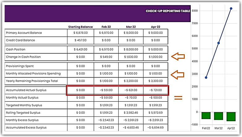
The data in this chart is derived from the amount you put in the Monthly Check-up and the Provisions Jar in the MoneySMARTS page.
Here’s how the charts are computed:
For the Bar Chart:
- The MoneySMARTS Dashboard.
- Look for the “Provisions Jar” and click on it.
- Scroll down and you’ll see the amount in “Total Provision Balance” row.
- Divide the total amount to 12 months to get your monthly allocated provision.
- The Change in Cash Position is the change in your Monthly Check-up as compared to the previous month.
- The Bar in the Accumulated Actual Surplus chart is basically the accumulated amounts found in the Monthly Actual Surplus. See screenshot below.

For the Line Chart:
- The MoneySMARTS Dashboard
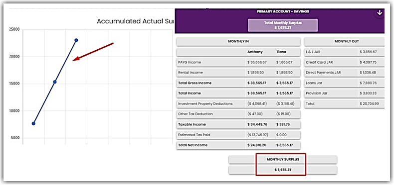
- Look for the “Primary Account – Savings”. You can find the “Total Monthly Surplus” just below it.
- You can click on “Primary Account – Savings” to see the breakdown.
- The Line in the Accumulated Actual Surplus chart is basically the accumulated Monthly Surplus. See screenshot below.

👉 To learn more about how to implement MoneySMARTS, click here.


